When AI Eyes Disagree: Benchmarking LLM Vision on Radial Charts
We gave Claude and ChatGPT the same Enneagram radial chart and asked a simple question. The results reveal fundamental differences in how frontier models perceive complex visualisations — and what that means for building reliable agentic AI systems.
The Setup: One Chart, One Question, Two Models
At Basic Insight, we routinely work with data visualisations — survey outputs, brand tracking dashboards, competitive intelligence charts. As we build AI-powered tools for our market research practice, we need to understand exactly where frontier models excel and where they fail at visual interpretation. This experiment started when I gave both Claude and ChatGPT a simple real-world scenario. I had an Enneagram personality test result displayed as a variable-radius radial chart (sometimes called a rose or coxcomb chart), where each of nine personality types occupies an equal angular wedge, and the radius of each wedge represents the score. A bigger slice means a higher score. I asked both models the same straightforward question: “Which are the biggest slices of this graph?”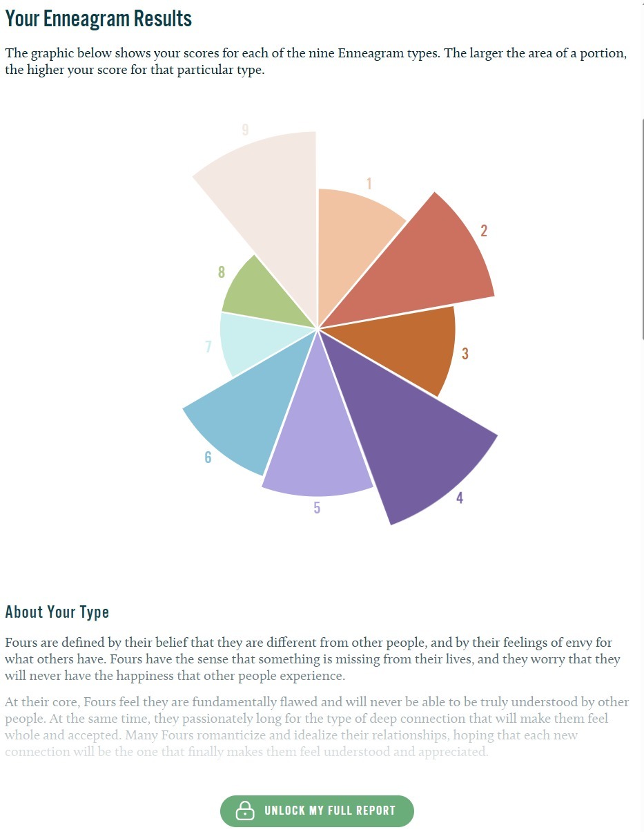
Figure 1: The Enneagram radial chart used in this experiment. Each wedge’s radius represents the score for that personality type — a format that proves surprisingly difficult for AI vision models to interpret accurately.
The Results: A Clear Divergence
The ground truth, validated by my own visual assessment of the chart, ranked the top three slices as Type 4 (largest), Type 9 (second), and Type 2 (third). Here is how each model performed:| Model | Top 3 Answer | Verdict |
|---|---|---|
| ChatGPT 5.4 (Thinking) | Type 4, Type 9, Type 2 | ✓ CORRECT |
| Claude Opus 4.6 (Gestalt) | Type 4, Type 5, Type 6 | ✗ INCORRECT |
| Claude Opus 4.6 (CoT, clean session) | Type 4, Type 5, Type 3/6 | ✗ INCORRECT |
| Claude Opus 4.6 + Python CV pipeline | Type 4, Type 5, Type 3 | ✗ INCORRECT |
What I Tried to Fix It
Rather than accept the initial failure at face value, I systematically tested three remediation strategies within Claude to understand whether the error was at the perception level or the reasoning level.Attempt 1: Computer Vision Pipeline
I had Claude write a Python script using PIL and NumPy to programmatically analyse the chart image. The approach: identify the chart’s centre point, compute the angle and distance from centre for every coloured pixel, divide the 360° circle into nine equal wedges, and measure the average maximum radius per wedge as a score proxy.Attempt 2: Chain-of-Thought Prompting
I then tested whether forcing Claude into systematic, segment-by-segment reasoning would overcome the perceptual error. Instead of a gestalt judgement, the prompt required Claude to evaluate each type’s radius independently and estimate it as a percentage of maximum before ranking.Attempt 3: More Elaborate CV with Edge Detection
A more sophisticated approach would use Hough circle transforms to find the exact centre, k-means colour clustering to cleanly segment slices, and contour analysis for precise boundary detection. While theoretically more robust, this adds significant complexity and still has failure modes — it is a brittle bandaid over a model-level perception gap.Key Findings
Perception > Reasoning
Claude’s vision model has a consistent, repeatable weakness with variable-radius radial charts. The error is perceptual, not logical — better prompting cannot fully compensate for incorrect initial visual encoding.CoT Is Not a Universal Fix
Chain-of-Thought prompting, often cited as a performance enhancer, did not help when the underlying visual perception was wrong. You cannot reason your way out of seeing something incorrectly.Code Adds Precision, Not Accuracy
Running Python analysis on the image produced more precise but equally wrong results. A programmatic pipeline only helps if the foundational assumptions (centre point, boundaries) are correct.Confirmation Bias Is Real
When tested after exposure to the correct answer, Claude appeared to self-correct. This was anchoring, not genuine improvement — a critical trap when evaluating AI model capabilities.Implications for Agentic AI Architecture
This experiment has direct implications for how we build production AI systems — particularly agentic workflows that need to interpret visual data autonomously.The Case for Multi-Model Routing
No single model excels at everything. The pragmatic approach is to build a routing layer that dispatches tasks to the most capable model for that specific task type. For complex visual chart interpretation, the system should know to route to the model with stronger spatial perception. For text reasoning, code generation, or structured analysis, a different model might win.Practical Design Principles
Task-aware model selection
Classify incoming tasks (text analysis, chart interpretation, code generation, creative writing) and route to the model with the strongest benchmark for that category.Confidence-gated cross-validation
When a model’s output falls below a confidence threshold, automatically send the same input to a second model. Flag disagreements for human review rather than silently choosing one.Continuous benchmarking
Model capabilities shift with each release. What fails today may succeed in six months. Maintain an automated evaluation suite that re-tests models on known failure cases as new versions are released.Extract data from source when possible
Vision-based chart reading should be the fallback, not the default. If the chart exists on a live webpage, extract the underlying data from the DOM or API. If raw numbers are available, use them.What This Does Not Mean
It would be easy to over-index on this result. A few important caveats: This is a single test on a single chart type. Claude outperforms ChatGPT on many other vision tasks, and the relative performance of models varies significantly across task categories. The point is not that one model is universally better, but that each model has distinct strengths and weaknesses that should inform architectural decisions. Variable-radius radial charts are genuinely hard — even for humans. The combination of angular position and variable radius makes precise comparison inherently difficult. This is an edge case, not a representative sample of typical chart interpretation tasks. Model capabilities evolve rapidly. By the time you read this, the specific performance gap described here may have narrowed or reversed. The architectural principle (multi-model routing with continuous benchmarking) remains valid regardless.Conclusion
Building reliable agentic AI is not about finding the single best model and deploying it everywhere. It is about understanding the specific capability profile of each available model and designing systems that leverage the right model for the right task. This small experiment — one chart, one question, two models — illustrates why multi-model architectures are not a luxury but a necessity for production AI systems. The frontier is not a single point; it is a surface, and different models occupy different positions on that surface depending on the task.Emily Chan is the Founding Partner and Operations Director of Basic Insight Sdn Bhd, a tech-enabled market research firm based in Kuala Lumpur. She leads the firm’s AI Research division, exploring practical applications of frontier AI models for market research, data analysis, and agentic automation.